Heidi Klum Milk Ad- Print Ad Found in a fashion magazine
More then Medication Commercial- Live Action Ad directed at a primetime audience
Love 'em Don't Eat 'em Ad- Print Ad, Public Service Announcement
Crest Whitestrips Ad- Live Action Ad directed at a specific audience
Sunday, November 29, 2009

Crest Whitestrips Ad
This commercial uses the logical fallacy everybody knows and figures prove. The commercial uses these two fallacies simultaneously. When you hear/read that crest white strips are the “number one dentist recommended brand” you are getting the impression that everyone else knows about it. Since all these dentists are recommending it, the whole world must know about these white strips. Also, the commercial does not site it’s information. So we don’t know what kind of dentist’s were surveyed or how they were selected. For all we know, the survey that crest performed could be completely bias, but when the information is being thrown at us in a commercial, we just accept it to be true.
This commercial uses a variety of techniques to make it work. One of these ways is the colours that are used. The colours that are primarily used are blue and white. Blue is the signature crest colour. Since the general public associates crest with this shade of blue they immediately know that this commercial is for crest when the commercial starts. This is why the advertiser doesn’t need to that the commercial is for crest right when the commercial starts. The white that is used in the commercial reflects the white teeth that you will have if you use this product. It subliminally conveys the message that this product will give you whiter teeth. Also, since the producer has made the writing white and the background blue, it helps the writing to stand out. Another thing that has been done with the writing, is that at first it is covered up with a white strip, and then the white strip is peeled away, to reveal the pearly white writing. This symbolizes what will happen with your teeth when you use crest white strips.
Another technique the advertiser uses is the length of the commercial. The producer realizes that as humans we have a very short attention span. So, they made the commercial to be only 15 seconds long. It is just long enough to get the message across, but not so long that people are going to lose interest. Also, the commercial ends with a picture of the product in it’s packaging. That way, you are left with the image that you would see at the store. This is very clever because the advertiser is making sure that you will recognize the product when you see it. The commercial also uses a shot of a smiling woman with white teeth to promote their product. Nowhere in the ad does it say that this woman uses crest white strips, yet we all assume that she does and that they give her the white smile that she is fashioning. This also makes people think that if they use crest white strips they will be happy like her and that their teeth will look like her teeth.
This commercial appeals to adults who want whiter teeth. It uses the picture of a woman in her thirties which makes it clear that the ad is not directed at young adults or teenagers. And this makes sense for the product. Most teenagers don’t worry about their teeth as must as adults do. Also, teeth can yellow with age, so older people would worry more about getting yellow teeth then young people. Overall, this ad works because it appeals to a specific audience, but that audience is large, it is short, it uses logical fallacies, it uses colour to it’s advantage and it is a product that a lot of people would be interested in to buy.
This commercial uses a variety of techniques to make it work. One of these ways is the colours that are used. The colours that are primarily used are blue and white. Blue is the signature crest colour. Since the general public associates crest with this shade of blue they immediately know that this commercial is for crest when the commercial starts. This is why the advertiser doesn’t need to that the commercial is for crest right when the commercial starts. The white that is used in the commercial reflects the white teeth that you will have if you use this product. It subliminally conveys the message that this product will give you whiter teeth. Also, since the producer has made the writing white and the background blue, it helps the writing to stand out. Another thing that has been done with the writing, is that at first it is covered up with a white strip, and then the white strip is peeled away, to reveal the pearly white writing. This symbolizes what will happen with your teeth when you use crest white strips.
Another technique the advertiser uses is the length of the commercial. The producer realizes that as humans we have a very short attention span. So, they made the commercial to be only 15 seconds long. It is just long enough to get the message across, but not so long that people are going to lose interest. Also, the commercial ends with a picture of the product in it’s packaging. That way, you are left with the image that you would see at the store. This is very clever because the advertiser is making sure that you will recognize the product when you see it. The commercial also uses a shot of a smiling woman with white teeth to promote their product. Nowhere in the ad does it say that this woman uses crest white strips, yet we all assume that she does and that they give her the white smile that she is fashioning. This also makes people think that if they use crest white strips they will be happy like her and that their teeth will look like her teeth.
This commercial appeals to adults who want whiter teeth. It uses the picture of a woman in her thirties which makes it clear that the ad is not directed at young adults or teenagers. And this makes sense for the product. Most teenagers don’t worry about their teeth as must as adults do. Also, teeth can yellow with age, so older people would worry more about getting yellow teeth then young people. Overall, this ad works because it appeals to a specific audience, but that audience is large, it is short, it uses logical fallacies, it uses colour to it’s advantage and it is a product that a lot of people would be interested in to buy.
Saturday, November 28, 2009
Love 'em Don't Eat 'em PSA
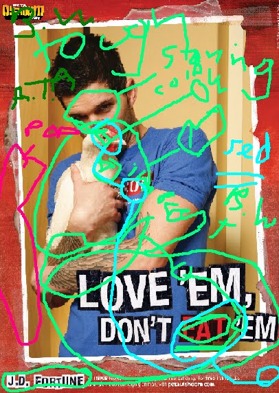
This ad uses 3 different logical fallacies. These three are guilt by association, black or white and appeal to authority. In the ad, you see J.D. Fortune holding a chicken with the words, “Love ’em, Don’t eat ’em” written underneath. When you see the innocent, helpless chicken, you feel guilty for eating meat (unless you’re a vegetarian). This is guilt by association because anyone who eats meat and then sees this poor chicken, would feel guilty for being responsible for ending an animal’s life. The ad uses black or white with the text that is at the bottom of the ad. The text reads: “Love ’em, don’t eat ’em.” These words imply that you either love the animals, or you eat them. The ad presents no alternative or middle ground. So, for example, you can’t love the animals and still eat them. The ad gives you two clear choices and makes you pick one or the other. The third fallacy used is appeal to authority. The man that you see holding the chicken, is J.D. Fortune, formerly of the rock band INXS. By using him in the ad, the producer of the ad is saying that if you want to be like this guy, you should be a vegetarian.
In this ad you see a rocker promoting being a vegetarian. This is an interesting approach, because most people associate vegetarian with “hippie” or “organic hemp” and not “rock.” At the same time, most people would assume that rock stars are all hard core, meat eaters, instead of animal lovers. However, this ad shows that you can be hard core rock and still be an animal lover and vegetarian. This ad is directed to people who love animals and eat meat, by saying that you can’t possibly do both. It also is speaking to people who like to rock and also like animals, to them it says, you can do both. It is kind of ironic that with both audiences the ad it directed at, it is giving off separate messages. To one group it is saying, you have to pick one side or the other, and to the other group it is saying, you don’t have to choose. That is how black or white and appeal to authority and guilt by association all work together to target different groups.
The first thing you see when you look at this ad is J.D. Fortune’s black eyes staring at you. The stare is intense and almost threatening. It makes you wonder why he looks so angry. You then see that his head is bent down, almost pointing to the chicken that he is holding. The chicken looks innocent and maybe a bit scared, and is also staring at you. You feel compassion for the chicken and you also realize that J.D. Fortune also feels compassion for the chicken because he is hugging the chicken and nuzzling it. Your eye then goes to the bold writing at the bottom. The writing is white, outlined in black. This really makes the writing stand out and makes it noticeable. The only exception is the word “eat” which is in red. I think that this word is in read because the producer of the ad wanted to make it very clear that you are eating the chicken. The word “eat” is red outlined in black. Red is also the colour of blood, and that reminds the audience of the blood that has to be spilt in order for you to eat the chicken. This red also matches the parts of the chicken’s head, the writing on J.D.’s shirt and the border. All of this makes the red “pop” and makes it more noticeable.
The use of the border also helps to make the whole ad stand out, and it provides more red, which reminds us of blood. In addition, the background colour, matches the colour of the chicken’s body. This compliments the chicken and helps it to stand out against J.D.’s body. This ad has a common theme, it all looks rather rugged. The border looks like ripped paper, J.D.’s tattoos are very obviously displayed and even the writing. It says “eat ’em” instead of “eat them.” This all add to the “rock and roll” effect. Since the ad matches the rock and roll thoughts we associate with J.D. Fortune, this use of a more jagged feel for the rest of the ad only makes sense. This reinforces the idea that being a vegetarian can be cool and hard core.
As you can see, this ad uses a variety of techniques to relay it’s message, including 3 different logical fallacies.
In this ad you see a rocker promoting being a vegetarian. This is an interesting approach, because most people associate vegetarian with “hippie” or “organic hemp” and not “rock.” At the same time, most people would assume that rock stars are all hard core, meat eaters, instead of animal lovers. However, this ad shows that you can be hard core rock and still be an animal lover and vegetarian. This ad is directed to people who love animals and eat meat, by saying that you can’t possibly do both. It also is speaking to people who like to rock and also like animals, to them it says, you can do both. It is kind of ironic that with both audiences the ad it directed at, it is giving off separate messages. To one group it is saying, you have to pick one side or the other, and to the other group it is saying, you don’t have to choose. That is how black or white and appeal to authority and guilt by association all work together to target different groups.
The first thing you see when you look at this ad is J.D. Fortune’s black eyes staring at you. The stare is intense and almost threatening. It makes you wonder why he looks so angry. You then see that his head is bent down, almost pointing to the chicken that he is holding. The chicken looks innocent and maybe a bit scared, and is also staring at you. You feel compassion for the chicken and you also realize that J.D. Fortune also feels compassion for the chicken because he is hugging the chicken and nuzzling it. Your eye then goes to the bold writing at the bottom. The writing is white, outlined in black. This really makes the writing stand out and makes it noticeable. The only exception is the word “eat” which is in red. I think that this word is in read because the producer of the ad wanted to make it very clear that you are eating the chicken. The word “eat” is red outlined in black. Red is also the colour of blood, and that reminds the audience of the blood that has to be spilt in order for you to eat the chicken. This red also matches the parts of the chicken’s head, the writing on J.D.’s shirt and the border. All of this makes the red “pop” and makes it more noticeable.
The use of the border also helps to make the whole ad stand out, and it provides more red, which reminds us of blood. In addition, the background colour, matches the colour of the chicken’s body. This compliments the chicken and helps it to stand out against J.D.’s body. This ad has a common theme, it all looks rather rugged. The border looks like ripped paper, J.D.’s tattoos are very obviously displayed and even the writing. It says “eat ’em” instead of “eat them.” This all add to the “rock and roll” effect. Since the ad matches the rock and roll thoughts we associate with J.D. Fortune, this use of a more jagged feel for the rest of the ad only makes sense. This reinforces the idea that being a vegetarian can be cool and hard core.
As you can see, this ad uses a variety of techniques to relay it’s message, including 3 different logical fallacies.
Thursday, November 26, 2009
More than Medication Commercial
This commercial uses the logical fallacy hasty generalization. However, it uses it in an interesting way. The commercial uses this fallacy intentionally, to help get their point across. They want the audience to take an inductive leap and use hasty generalization in the beginning of the commercial. They do this by presenting the audience with facts that are presented to make you assume something untrue. The commercial does this with the teenage boy that we see in the beginning of the commercial. They boy looks like a typical troublemaker. He has on baggy jeans, a hat which is worn off to the side, and a baggy sweater as well as various piercings. Also, he is in a dark, deserted alleyway. In addition, he has a spray paint can and he is spray painting the sides of buildings. The creator of the commercial has also added music that contributes to the mood of the commercial because it is a bit spooky and eerie, as if something bad is happening. All of this put together makes the audience think that the boy is vandalising the buildings and that he is a bad kid. Another contributing factor is that the area he is in looks to be run down. It has older building and not much light. It reminds me of an alleyway in a rundown part of New York City. These facts make the audience take an inductive leap and use the logical fallacy hasty generalization, which is exactly what the ad producers want us to do.
After the boy is done spray painting, he is seen entering an apartment building. The apartment building is also run down, with little paint or decoration. It looks fairly drab. This of course is more proof that the boy is up to trouble. When he gets up to his apartment, we see a woman, most likely his mother, looking disappointed. She looks at her watch and gives the boy a look that seems to say “Again? I’m really disappointed in you.” This makes the audience think that this has happened before and that this boy has a history of trouble. The mother in the commercial looks really worn out and tired. We assume it’s because her son was out all night again. The boy gives her a shrug and a defensive look and then proceeds to take a vase of flowers and bring them into a bedroom. At this point the audience is intrigued. We don’t know what he is about to do. The mother in the commercial reflects this emotion. She looks confused. Then, the boy walks into a room where a little girl is lying in a big bed, with tubes running out of her. It is clear that this girl is ill with something serious. The boy then puts the flowers on her bedside table and opens up the curtains. A look of amazement crosses the girl’s face as well as the mother’s. The mother then mouths “thank you” and the boy just humbly nods his head. At this point the audience is hooked. We don’t know what to expect. It seems as though our inductive leap was completely off and now we want to know the truth. We then get a shot of the view outside the little girl’s window. All across the buildings the boys has spray pained flowers and the words “Be Brave” for his little sister.
This commercial is successful for many reasons. First of all, the audience is hooked from almost the very beginning. Right when we see the boy spray painting we think, “what is he doing?” and “how is this going to turn out?” We then think that we know what is happening but we still want to know what the consequence for his actions will be. So we keep watching. Then when we see the mother, we all think that she’s going to get angry or something but she doesn’t, and then when the boy walks into the little girl’s room it is even more intriguing because we are curious as to what’s going to happen and how the little girl works into the plotline. Finally, when we realize that the boy did something good, we are anxious to know what it was. And when we see what he did we are both shocked and touched. This commercial is one that you remember because the commercial producer had you completely fooled. You were at their mercy so totally that when you realize that you had it wrong it shocks you and that shock is something that you remember. Also, when you see the little girl who is so sick, you can’t help but feel compassion. This ad tugs at your heart strings and makes you want to support the cause.
One thing that the ad producer has done to help make the ad effective is the use of lighting. At the beginning of the commercial it is very dark and shady. This is when you think that the boy is up to no good. Then as you get to the apartment, it starts to lighten up a bit and finally, when the boy opens the curtains and you see what he’s done, the last of the light streams in. As the ad progresses and the boy’s intentions become clearer and clearer, you get more and more light. It takes the saying “shed some light on the situation” quite literally. Another thing that the ad producer has used is sound. As mentioned previously, in the beginning of the commercial the music that is played is a bit spooky and eerie. Also, the sound of the spray paint is almost amplified, as if to highlight its use. As the commercial continues, the music gets let eerie and lighter. Then, when the curtains are thrust open, the music seems to soar, almost like there is hope for the little girl, like he is giving her hope through his art. There is no dialogue in the commercial and I think that makes it more powerful because it proves the saying “actions speak louder than words.” One final thing that the producer has done is they have made the mother a reflection of the audience, in a way. The mother is put in the same place as the audience when she sees her son come in the apartment. She thinks he has been up to no good and she is disappointed in him. Then, when he takes the flowers, she is confused, just like the audience. Finally, she is thankful for what he has done, and she is proud. This helps the ad because it helps the audience relate to someone in the ad. If the audience can relate to someone in the ad, then it is more likely to affect us, because it is relevant to our lives. As you can see, this ad uses many different techniques to be effective, including the intentional use of a logical fallacy.
After the boy is done spray painting, he is seen entering an apartment building. The apartment building is also run down, with little paint or decoration. It looks fairly drab. This of course is more proof that the boy is up to trouble. When he gets up to his apartment, we see a woman, most likely his mother, looking disappointed. She looks at her watch and gives the boy a look that seems to say “Again? I’m really disappointed in you.” This makes the audience think that this has happened before and that this boy has a history of trouble. The mother in the commercial looks really worn out and tired. We assume it’s because her son was out all night again. The boy gives her a shrug and a defensive look and then proceeds to take a vase of flowers and bring them into a bedroom. At this point the audience is intrigued. We don’t know what he is about to do. The mother in the commercial reflects this emotion. She looks confused. Then, the boy walks into a room where a little girl is lying in a big bed, with tubes running out of her. It is clear that this girl is ill with something serious. The boy then puts the flowers on her bedside table and opens up the curtains. A look of amazement crosses the girl’s face as well as the mother’s. The mother then mouths “thank you” and the boy just humbly nods his head. At this point the audience is hooked. We don’t know what to expect. It seems as though our inductive leap was completely off and now we want to know the truth. We then get a shot of the view outside the little girl’s window. All across the buildings the boys has spray pained flowers and the words “Be Brave” for his little sister.
This commercial is successful for many reasons. First of all, the audience is hooked from almost the very beginning. Right when we see the boy spray painting we think, “what is he doing?” and “how is this going to turn out?” We then think that we know what is happening but we still want to know what the consequence for his actions will be. So we keep watching. Then when we see the mother, we all think that she’s going to get angry or something but she doesn’t, and then when the boy walks into the little girl’s room it is even more intriguing because we are curious as to what’s going to happen and how the little girl works into the plotline. Finally, when we realize that the boy did something good, we are anxious to know what it was. And when we see what he did we are both shocked and touched. This commercial is one that you remember because the commercial producer had you completely fooled. You were at their mercy so totally that when you realize that you had it wrong it shocks you and that shock is something that you remember. Also, when you see the little girl who is so sick, you can’t help but feel compassion. This ad tugs at your heart strings and makes you want to support the cause.
One thing that the ad producer has done to help make the ad effective is the use of lighting. At the beginning of the commercial it is very dark and shady. This is when you think that the boy is up to no good. Then as you get to the apartment, it starts to lighten up a bit and finally, when the boy opens the curtains and you see what he’s done, the last of the light streams in. As the ad progresses and the boy’s intentions become clearer and clearer, you get more and more light. It takes the saying “shed some light on the situation” quite literally. Another thing that the ad producer has used is sound. As mentioned previously, in the beginning of the commercial the music that is played is a bit spooky and eerie. Also, the sound of the spray paint is almost amplified, as if to highlight its use. As the commercial continues, the music gets let eerie and lighter. Then, when the curtains are thrust open, the music seems to soar, almost like there is hope for the little girl, like he is giving her hope through his art. There is no dialogue in the commercial and I think that makes it more powerful because it proves the saying “actions speak louder than words.” One final thing that the producer has done is they have made the mother a reflection of the audience, in a way. The mother is put in the same place as the audience when she sees her son come in the apartment. She thinks he has been up to no good and she is disappointed in him. Then, when he takes the flowers, she is confused, just like the audience. Finally, she is thankful for what he has done, and she is proud. This helps the ad because it helps the audience relate to someone in the ad. If the audience can relate to someone in the ad, then it is more likely to affect us, because it is relevant to our lives. As you can see, this ad uses many different techniques to be effective, including the intentional use of a logical fallacy.
Heidi Klum Milk Ad
This advertisement uses the logical fallacy appeal to authority. Milk is using a public figure to endorse a product sending across the message that if you drink milk, you can be like this person. This ad uses a variety of ways to imprint their message. First of all, Heidi Klum’s long leg is in almost the centre of the page. This draws our attention to the leg. A lot of people struggle with body image and weight and by showing the audience this healthy, attractive leg right away, captures the attention of the audience. Once people notice the leg, they follow the leg up to her body and her face. While this is happening, people notice her fit figure and healthy skin and glamourous dress. All of this makes the audience jealous of Ms. Klum because she looks so healthy.
Once your eye goes up to her face, you notice her happy smile and her face. Her face isn’t young, but it still is pretty without fine lines. Once you are looking at her face, you see her white teeth and white milk moustache. This automatically makes you think of milk. Using a celebrity to endorse their product is somewhat of a trademark for milk. And in almost all of their ads, the famous figure is fashioning a milk moustache. The white of the teeth and moustache matches the white writing that is in the top left corner of the ad. That is where your eye goes next. This writing says "got milk?" in the classic font that milk always uses. This font and the color of the font matches the font and color of the writing next to Ms. Klum. This writing talks about how even though Heidi Klum is a model, she is still a mom and that milk helps her accomplish this. This writing also matches the glass of milk that sits at Heidi Klum’s feet. This milk glass relays the message that Ms. Klum always has a glass of milk nearby. In fact, the glass of milk is right beside her shoes, which conveys the message that Heidi Klum’s glass of milk is as important to her as her shoes. The glass of milk isn’t a focal point in the ad, but it doesn’t have to be because milk uses it’s classic font and classic ad style, which the audience immediately recognizes as milks signature look.
All of this helps milk relay their message that drinking milk will keep you healthy. All of this also helps the audience make the inductive leap that if y u drink milk you can have a life like Heidi Klum and you will look like her. Some other factors milk uses to help their ad are the fact that in the background there are a lot of vertical lines. The stool leg, the curtains, and paneling on the walls are all vertical lines. These lines help compliment Heidi Klum’s leg. Also, The spotlights in the background are the same color as the milk glass on the floor and the writing. This helps to draw out the important writing and the milk. In addition, the edges of the ad are darker, and as you move towards the centre of the ad, it gets lighter. This helps draw your attention to Heidi Klum who is in the centre of the page. As you can, see the logical fallacy appeal to authority was used in this ad by using a public figure to promote a product.
This ad was found in a Canadian Living magazine. This particular ad was placed in this magazine because it is aimed at mothers. In the writing beside her, Heidi Klum talks about how it’s important to be a mother and how drinking milk helps her balance her work and her motherly duties. This appeals to women who read Canadian Living because typically the people who read this magazine are mothers. By showing these mothers an ad of a fellow mother, who is famous, attractive, has a balanced life and is using their product, they are appealing to the demographic. This ad was very strategically placed to appeal to a certain type of people.
Once your eye goes up to her face, you notice her happy smile and her face. Her face isn’t young, but it still is pretty without fine lines. Once you are looking at her face, you see her white teeth and white milk moustache. This automatically makes you think of milk. Using a celebrity to endorse their product is somewhat of a trademark for milk. And in almost all of their ads, the famous figure is fashioning a milk moustache. The white of the teeth and moustache matches the white writing that is in the top left corner of the ad. That is where your eye goes next. This writing says "got milk?" in the classic font that milk always uses. This font and the color of the font matches the font and color of the writing next to Ms. Klum. This writing talks about how even though Heidi Klum is a model, she is still a mom and that milk helps her accomplish this. This writing also matches the glass of milk that sits at Heidi Klum’s feet. This milk glass relays the message that Ms. Klum always has a glass of milk nearby. In fact, the glass of milk is right beside her shoes, which conveys the message that Heidi Klum’s glass of milk is as important to her as her shoes. The glass of milk isn’t a focal point in the ad, but it doesn’t have to be because milk uses it’s classic font and classic ad style, which the audience immediately recognizes as milks signature look.
All of this helps milk relay their message that drinking milk will keep you healthy. All of this also helps the audience make the inductive leap that if y u drink milk you can have a life like Heidi Klum and you will look like her. Some other factors milk uses to help their ad are the fact that in the background there are a lot of vertical lines. The stool leg, the curtains, and paneling on the walls are all vertical lines. These lines help compliment Heidi Klum’s leg. Also, The spotlights in the background are the same color as the milk glass on the floor and the writing. This helps to draw out the important writing and the milk. In addition, the edges of the ad are darker, and as you move towards the centre of the ad, it gets lighter. This helps draw your attention to Heidi Klum who is in the centre of the page. As you can, see the logical fallacy appeal to authority was used in this ad by using a public figure to promote a product.
This ad was found in a Canadian Living magazine. This particular ad was placed in this magazine because it is aimed at mothers. In the writing beside her, Heidi Klum talks about how it’s important to be a mother and how drinking milk helps her balance her work and her motherly duties. This appeals to women who read Canadian Living because typically the people who read this magazine are mothers. By showing these mothers an ad of a fellow mother, who is famous, attractive, has a balanced life and is using their product, they are appealing to the demographic. This ad was very strategically placed to appeal to a certain type of people.
Subscribe to:
Posts (Atom)